Esmerelda Toys
When Unicorn Marketing Co. came to me to work on a brand refresh for a local, woman-owned brand, I jumped at the opportunity. I got even more excited when I found out it was for a sexy toy brand!
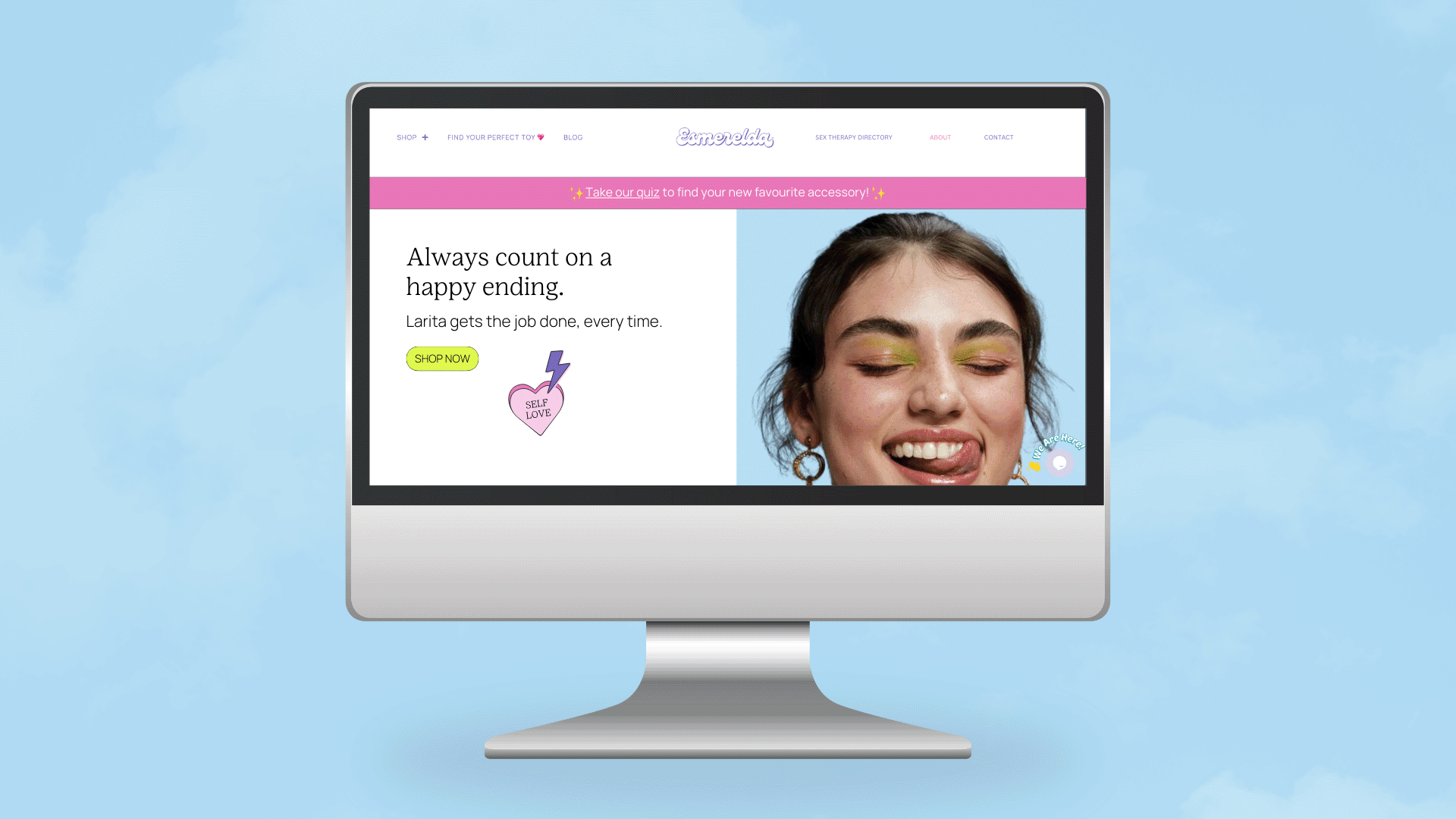
We wanted to represent a modern, millennial-friendly brand that would stand up against competitors. Since this is a sensitive subject, we needed to build trust with potential buyers. We decided to streamline the name and drop the ‘Eso Es’ from the original brand name because it was confusing, especially for a majority English-speaking audience.
Esmerelda represents femininity and kindness, and keeping the brand feeling welcoming and inclusive was essential. We kept the Esmerelda signature purple and ditched the rest, updating the palette to be dreamy, fun, and vibrant, with accents of punchy lime to spice things up.
We updated the logo's typeface to a more sassy and bold script font to pay homage to the previous branding. To tie the brand together, we wanted to use dreamy cloud backdrops mixed with bold, on-brand coloured ones for the product photography (with diverse models and cute nail polish, cause duh). Photos were shot by the incredible Still Olive (highly recommend!). I directed the brand to the Unicorn team, who worked their magic to create a clean, user-friendly, shoppable, and spiffy new website.
Scope
Brand Refresh, Illustration, Creative Direction